 Nguyen Manh Thang
Chief Executive Officer, AgileTech Vietnam
Nguyen Manh Thang
Chief Executive Officer, AgileTech Vietnam
- Published
- Last updated
- Read time
- 11 min
- Views
- 186
Read the AI overview
The UI design trends that matter in 2026 are the ones changing how interfaces work, not just how they look: AI-adaptive interfaces that reshape themselves around intent, the depth revival that brought shadows, glass and dimensionality back after a decade of flatness, variable fonts turning typography into a responsive system, dark mode maturing from feature to default design target, gesture and spatial patterns normalized by edge-to-edge devices, calm design that treats attention as a resource to protect, and accessibility moving from checklist to craft. The adoption test for any of them is the same: does the trend serve your users' tasks, does it survive your brand, and can your team maintain it. A trend that fails any of the three is fashion, and fashion in a product interface is technical debt with better lighting.
Interface fashion moves in cycles, and articles about it usually age like fruit. Flat design killed skeuomorphism, then neumorphism flickered, then glassmorphism returned translucency, and each wave produced a thousand listicles that read as period pieces two years later. This guide takes a different contract with the reader: the trends below are selected for mechanical substance, what they change about how an interface functions, and each comes with the cost of adoption and the test for whether it belongs in your product at all.
The 2026 landscape has a genuine inflection in it: AI moved from feature to material. Interfaces are beginning to adapt their own structure to the user's behavior and stated intent, which changes design work more than any visual fashion of the past decade. Around that center, the durable movements, the depth revival, variable type systems, dark-mode-first design, gesture-native navigation, calm interfaces and accessibility as craft, are each reshaping day-to-day product design in ways worth acting on.
Throughout, the frame is the working designer's and the product owner's, not the awards jury's. For the process that turns any visual direction into a shippable, testable interface, the companion piece is the UI and UX design practice guide; this page is about choosing directions worth that process.
Key takeaways
- Trends split into mechanics and cosmetics. AI-adaptive layouts, variable type systems and accessibility-as-craft change how interfaces work; gradient fashions change how screenshots look. Budget attention accordingly.
- The depth revival is real but disciplined: shadows, translucency and dimensionality returned as hierarchy tools, not as the ornament of the skeuomorphic era.
- Dark mode is now a design target, not a filter. Designing both modes from tokens up costs little at the start and a rebuild when retrofitted.
- AI in the interface is two different trends: generative surfaces users converse with, and adaptive layouts that quietly reorder around behavior. The second ships value with far less risk.
- Calm design is the counter-trend with staying power: fewer interruptions, respectful notifications and attention budgets are becoming a competitive feature, not an aesthetic.
- Every adoption decision should pass three gates: serves the task, survives the brand, maintainable by the team. Two of three is a no.
Trends versus fashion: the three-gate adoption test

A trend earns adoption when it changes something measurable about how users succeed at tasks: comprehension speed, error rates, reach for one-handed use, legibility across lighting conditions, time to first meaningful action. Fashion changes how a product photographs. The distinction matters because adoption is never free: every visual direction added to a product must be built, systematized into tokens and components, taught to every designer and engineer who touches the interface, and maintained across every screen it touches. A fashion adopted product-wide is a tax the team pays quarterly, forever, for a screenshot that stopped being fashionable before the debt was paid.
Hence the three-gate test this article applies to everything it covers. Gate one: does it serve the task, is there a mechanism by which this pattern makes your users faster, less confused, or less fatigued, and can you name the metric it should move. Gate two: does it survive the brand, does the direction express what your product is, or does it dress a banking app like a music player because the music player won awards. Gate three: can the team maintain it, do you have the design-system maturity to tokenize it, the engineering capacity to implement it consistently, and the governance to keep it coherent as the product grows.
Two of three is a no. A trend that serves tasks and suits the brand but exceeds the team's maintenance capacity becomes inconsistency within two quarters, and inconsistency is worse than plainness. This discipline is also what makes trend adoption compatible with a design system rather than destructive of it: the system is the vehicle through which a direction is adopted once, tokenized, and propagated, rather than hand-painted screen by screen.
- Gate one, the task. Name the mechanism and the metric: comprehension, speed, errors, reach, legibility. No metric, no adoption.
- Gate two, the brand. The direction must express the product's character. Borrowed aesthetics read as borrowed within one session.
- Gate three, the team. Tokenizable, implementable, governable at your maturity. Otherwise it ships as drift, not as design.
AI in the interface: generative surfaces and adaptive layouts
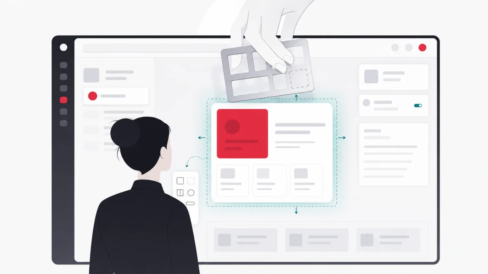
The largest genuine shift in interface design since touch is AI moving from a feature you visit to a material the interface is made of. It arrives as two distinct trends that get conflated. The first is the generative surface: conversational and prompt-driven interfaces where the user states intent and the system produces the artifact, a query, a draft, a design, an itinerary. Designing these well is a new craft, the blank prompt box is the new blank page, and the good patterns, suggested intents, visible reasoning, editable outputs, staged confirmation for consequential actions, are settling into a recognizable grammar.
The second, quieter trend is the adaptive interface: layouts, defaults and navigation that reorder themselves around observed behavior. The commuter's transit app that surfaces the evening route at five, the dashboard that promotes the modules a role actually uses, the checkout that remembers this user always ships to the office. None of it requires a chat window, and much of it ships more user value per unit of risk than conversation does, because it accelerates tasks users already perform instead of asking them to learn a new mode of asking.
The design obligations are real for both. Adaptive interfaces must remain predictable, an interface that rearranges itself too eagerly breaks spatial memory, the user's learned sense of where things live, so the pattern that works is stable structure with adaptive content: fixed regions whose contents personalize, visible reasons (because you ordered this weekly), and always a path to the full, unpersonalized catalog. Generative surfaces must manage trust: show provenance, make outputs editable rather than final, and never spend the user's confidence on an unmarked guess. Both directions pass gate one easily and strain gate three, they demand instrumentation, model plumbing and ongoing tuning that a static interface never needed.
AI-adaptive design: patterns that build trust and patterns that spend it
Do this
- Stable structure, adaptive contentFixed regions whose contents personalize. Spatial memory survives; the interface still feels learnable.
- Visible reasonsBecause you watch this weekly. A one-line explanation converts creepiness into service.
- Editable outputs, staged commitmentGenerated drafts the user refines, confirmation before consequential actions. The human stays the author.
- Instrument before you adaptAdaptation quality is bounded by behavioral data quality. Analytics is now a design dependency.
Not this
- Rearranging the whole interfaceLayouts that reshuffle per session break spatial memory and make the product feel haunted.
- Chat as the only doorForcing conversation for tasks a button did in one tap trades efficiency for fashion.
- Unmarked machine guessesGenerated content presented as fact spends trust the product cannot buy back.
- Personalization without an exitEvery adaptive view needs a path to the full, boring, complete catalog.
The depth revival: dimensionality returns as hierarchy, not ornament
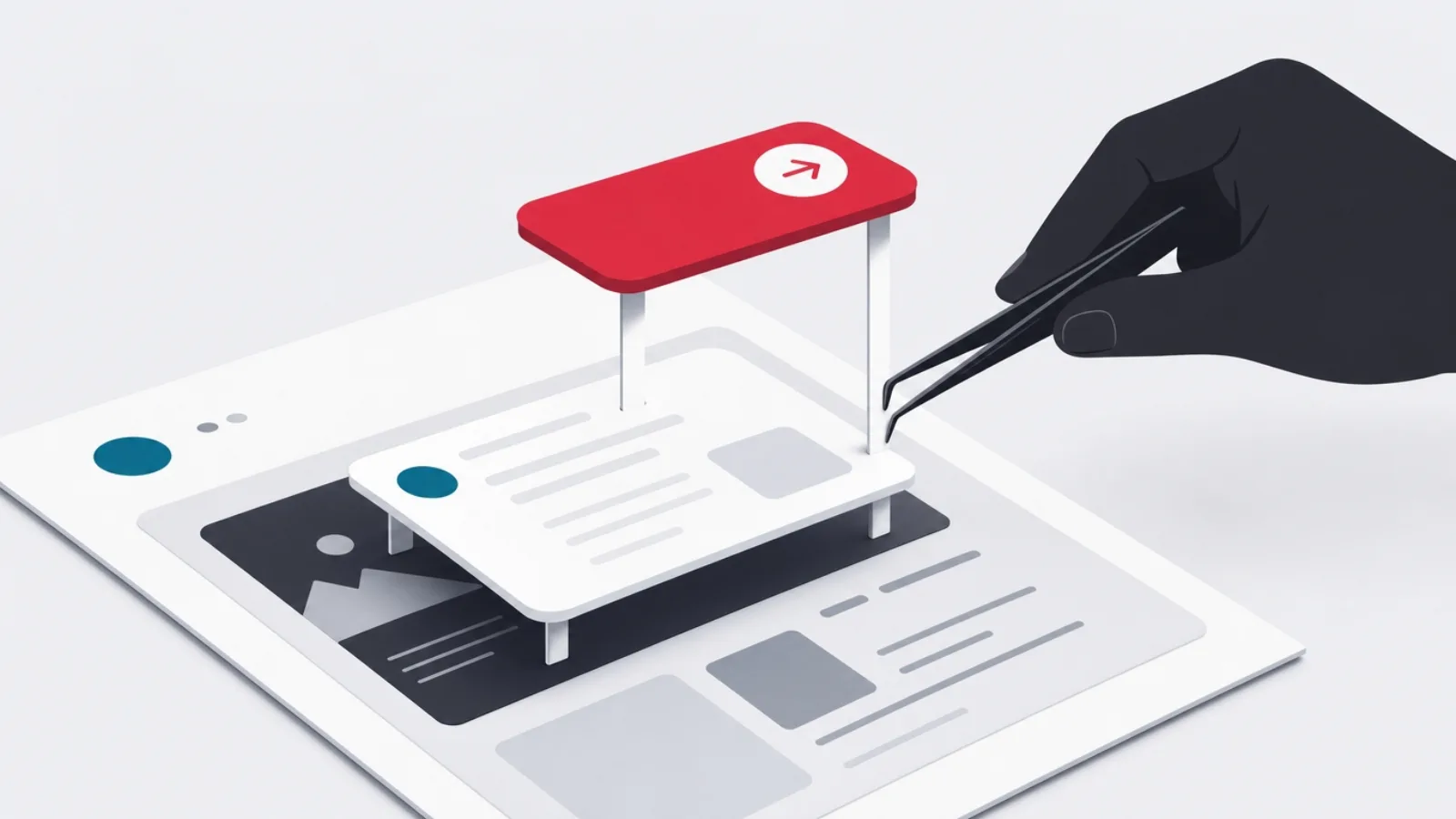
The flat-design decade solved a real problem, the ornamental clutter of skeuomorphism, and created another: interfaces where nothing looked pressable, layered or focused, and every element competed at the same visual depth. The revival of dimensionality, soft shadows, translucent panels, blur, gradients with a light source, subtle parallax, is the correction, and its current form is disciplined in a way the leather-stitched past was not. Depth is being used to encode hierarchy: what floats is actionable, what recedes is context, what blurs behind glass is background by declaration.
The platform vendors made this trend infrastructure. Modern OS design languages lean on translucent materials, layered surfaces and dynamic light, which means native-feeling apps inherit depth as a default rather than a decoration budget. The practical craft is restraint and consistency: a small vocabulary of elevation levels, two to four, each with a defined shadow and translucency recipe, tokenized in the design system, rather than per-screen artistic lighting. Glass effects carry an extra obligation: translucency degrades text contrast unpredictably over busy backgrounds, so every glass surface needs a contrast floor and a fallback.
The gate profile is friendly. Depth serves tasks when it clarifies what is interactive and what is layered, it survives most brands because the dial runs from whisper to loud, and it is maintainable wherever the elevation vocabulary is small and tokenized. The failure mode is additive enthusiasm, shadows plus glass plus gradients plus glow on the same component, which reads as 2009 within a sprint. One depth idea per surface is the working rule.
The depth toolkit and what each tool is for
| Tool | What it should encode | The clutter mistake |
|---|---|---|
| Elevation shadows | Interactivity and stacking order: what floats acts, what sits waits | Decorative shadows on static content |
| Translucent glass | Layering: this panel sits above live context | Glass over busy content with no contrast floor |
| Blur | Background by declaration: present but not competing | Blurring content the user still needs to read |
| Lit gradients | Surface orientation and brand warmth | A different gradient recipe per screen |
| Parallax and micro-motion | Spatial relationships during transitions | Motion long enough to feel like waiting |
Dimensionality as a hierarchy vocabulary. Each tool earns its place by encoding one thing, and the mistakes column is where trend becomes clutter.
Typography as system: variable fonts, fluid scale, type-first hierarchy
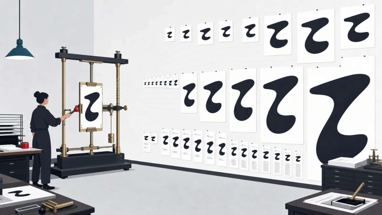
Typography moved from asset to system. Variable fonts, single files carrying continuous ranges of weight, width and optical size, turned type into something an interface tunes at runtime: headlines that gain weight at small sizes for legibility, data tables that tighten width under density, reading surfaces that adjust optical size to viewport. Combined with fluid type scales, sizes computed from the viewport rather than stepped at breakpoints, typography now behaves like the responsive system layout became a decade ago.
The visible fashion this enables, huge display type, editorial layouts, text as the hero of the screen, is the surface of a deeper shift: type-first hierarchy is cheaper and more accessible than chrome-first hierarchy. A screen whose structure is carried by a disciplined type scale needs fewer boxes, rules and background tints, renders faster, adapts to translation better, and scales with the user's accessibility settings by construction. The craft requirement is a real scale, five to seven named sizes with defined weights and line heights, tokenized, rather than the forty-three ad-hoc text styles most mature products discover they own on first audit.
Gate three deserves respect here. Variable fonts require licensing attention, loading strategy, subsetting for the character sets you serve, and a fallback plan, and fluid scales require QA across the viewport continuum, not just at three breakpoints. But of every trend in this article, the type system is the one with the best cost-to-longevity ratio: fashion in typefaces changes, and the system that lets you swap and tune type without touching a thousand screens is durable infrastructure.
The type-system upgrade, step by step
- Audit what you actually shipInventory every text style in the product. The count is always embarrassing, and the duplicates map the consolidation work.
- Define the scale as tokensFive to seven named steps, each with size, weight, line height and responsive behavior. This is the system's spine.
- Adopt a variable font deliberatelyLicense for your platforms, subset for your languages, define the weight and width ranges you will actually use.
- Make hierarchy type-firstRebuild key screens using scale and weight before boxes and tints. Measure comprehension, not applause.
- Respect user settingsThe scale must honor platform text-size preferences. A type system that fights accessibility settings is a regression.
Dark mode grew up: from toggle to co-equal design target
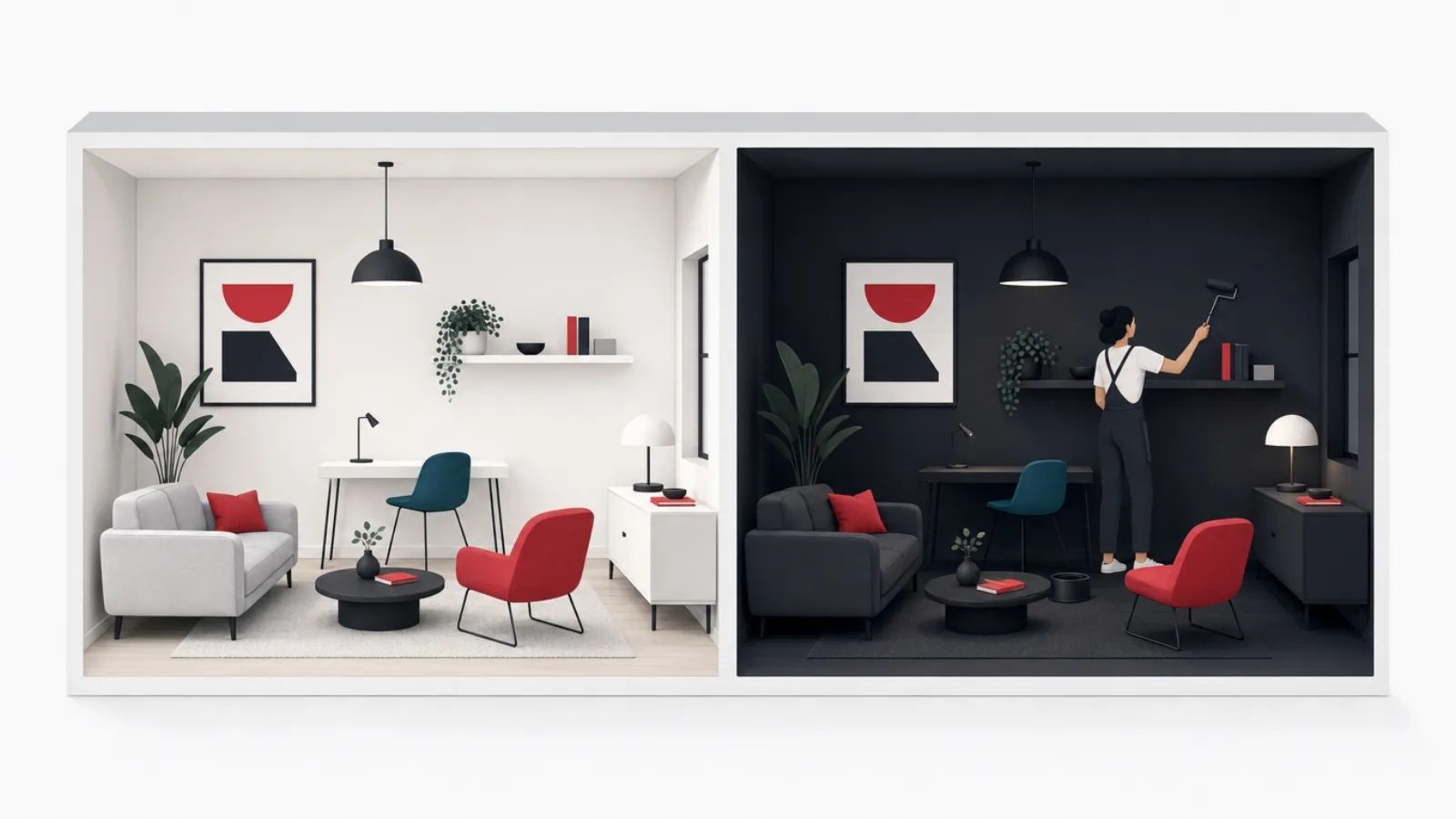
Dark mode stopped being a feature announcement years ago; what changed recently is its status in the design process. Mature teams now design both appearances from the token layer up, and a growing share of products, developer tools, media, finance, treat dark as the primary target because that is where their users live. The share of users choosing dark system-wide is large enough that shipping a neglected dark theme means shipping a neglected experience to a substantial fraction of every cohort.
The craft has consolidated into known rules. Dark mode is not inversion: pure black backgrounds and pure white text produce halation and eye strain, so the working palette is dark gray surfaces with elevated layers getting lighter, desaturated brand colors that hold contrast without vibrating, and shadows partially replaced by surface lightness as the elevation cue. Semantic color tokens, background, surface, surface-raised, text-primary, accent, rather than raw hex values, are what make maintaining two appearances a rendering concern instead of a parallel design effort. Images, illustrations and charts need their own dark treatment; a white-background diagram glowing out of a dark screen marks the theme as unfinished.
The gate profile: task service is real, legibility in low light, battery on OLED, user preference honored, brand survival requires actual work on color, and maintainability is entirely a function of whether the product's colors live in semantic tokens. For teams still carrying hex-coded colors, dark mode is the forcing function that finally pays for tokenization, and that infrastructure then makes every future visual trend cheaper to adopt.
Gesture-native navigation and the spatial frontier
Edge-to-edge screens deleted the buttons, and a generation of users now navigates by physics: swipe back, pull to dismiss, drag to reorder, long-press for context. Gesture-native design is no longer a differentiator, it is a floor, and the craft is in making gestures discoverable and forgiving: honoring platform conventions rather than inventing rival ones, keeping visible affordances for every gesture's critical path so the interface remains operable by tap alone, and designing thumb-first, with primary actions in reach on devices that keep growing.
The spatial computing frontier, headsets and the design languages built for them, remains a small market but an outsized influence. Its conventions, translucent materials, depth as information, eye-and-hand input, interfaces anchored in the user's space, are already visibly leaking back into flat-screen design: the glass panels and layered depth of current OS design languages are spatial ideas wearing 2D clothes. For most product teams the practical posture is fast-follow: design with layered materials and clean depth hierarchies that will translate if a spatial surface becomes commercially relevant to you, and let the platform vendors pay the exploration cost.
Micro-interactions matured alongside: motion in current practice is functional, spring physics that make direct manipulation feel physical, transitions that preserve context by showing where things came from and went, state changes announced by movement small enough to inform without delaying. The test for any animation is subtractive: if removing it loses information, it is design; if removing it only loses delight, it must be fast enough never to be waited on. Motion also carries an accessibility duty: respect reduced-motion preferences with meaningful fallbacks, not just disabled animations.
The reach and motion numbers that discipline the craft
The counter-trends: calm interfaces and accessibility as craft
The most consequential reaction in current design is against the attention economy's own excesses. Calm design treats user attention as a resource to protect rather than extract: notification systems with real granularity and honest defaults, home screens that surface one next action instead of twelve competing modules, focus modes, session summaries instead of streams, and the deliberate absence of manipulative mechanics, streak guilt, artificial urgency, confirm-shaming. What began as ethics is becoming positioning: in categories saturated with extractive products, respectful is a feature users can feel, name, and choose.
Accessibility completed a parallel promotion from compliance checklist to core craft, pushed by regulation, by legal exposure, by platform tooling, and by the realization that accessible design is just good design measured honestly: contrast that survives sunlight, touch targets that forgive, focus order that makes sense, motion that can be declined, labels that a screen reader can speak. The trend-relevant point is that accessibility now constrains and improves every other trend on this page: glass surfaces get contrast floors, adaptive layouts get predictable structure, type systems honor user scaling, motion respects reduced-motion preferences. Teams that treat accessibility as the grid every trend must fit ship trends that last.
Both counter-trends pass the three gates with unusual ease, they serve tasks by definition, they flatter nearly any brand, and their maintenance cost is mostly discipline, and both are unusually durable: no fashion cycle will make user attention less valuable or accessible products less legal. For a team allocating limited design investment across everything in this article, these two plus the type system are the compounding assets; adopt the rest as your product's tasks demand.
The 2026 vocabulary, briefly
- Adaptive interface
- Stable structure whose contents reorder around observed behavior and intent, with visible reasons and an exit to the full catalog.
- Generative surface
- Prompt-and-produce interfaces where users state intent and refine outputs. The blank prompt box is the new blank page.
- Elevation vocabulary
- A small tokenized set of depth levels, shadow, translucency, lightness, that encodes hierarchy consistently product-wide.
- Variable font
- A single font file carrying continuous weight, width and optical-size axes, tunable at runtime like any other responsive property.
- Semantic color tokens
- Named roles, surface, text-primary, accent, mapped per appearance. The infrastructure that makes dark mode and every future retheme cheap.
- Calm design
- Design that protects attention: granular notifications, honest defaults, one next action, and no manipulative mechanics.
Adopting trends without wrecking the product
The vehicle for adoption is the design system, and the order of operations is the whole game. A trend enters as a proposal with a gate-test writeup: the task mechanism, the metric, the brand fit, the maintenance plan. It gets prototyped on one or two high-traffic flows and measured, comprehension, speed, errors, complaint rates, against the incumbent design. If it earns its keep, it is tokenized, elevation recipes, type steps, color roles, motion durations, documented, and rolled out through components, so the hundredth screen inherits the trend for free. Products that skip the system step adopt trends screen by screen and end up owning a museum of their own redesigns.
Timing follows product category. Marketing surfaces and campaign pages can ride fashion cheaply, they are rebuilt seasonally anyway, and this is where gradient meshes, bento grids and oversized display type belong. Product interfaces should adopt on the trailing edge of proof: when a pattern has stabilized across platform vendors and category leaders, its usability findings are public, and its maintenance costs are known. Being first to a visual fashion wins a product nothing; being early to a mechanical shift, adaptive layouts, type systems, accessibility depth, compounds for years.
Finally, budget honestly for the unglamorous majority. Most of what makes an interface feel current is not any trend on this page; it is speed, coherence and forgiveness, screens that load fast, patterns that repeat, errors that can be undone. A dated-but-coherent interface outperforms a fashionable-but-chaotic one on every metric that reaches revenue. The trends are worth adopting when they are adopted the way everything else good in a product is: deliberately, systemically, and measured, the working method of the design practice guide.
The adoption pipeline, from spotting to shipping
-
Gate-test the candidateOne page
Write the task mechanism, the metric, the brand argument and the maintenance plan. Two of three gates is a rejection.
-
Prototype on real flowsOne sprint
One or two high-traffic screens, tested against the incumbent design with real users and real metrics.
-
Tokenize before scalingThe system step
Elevation, type, color and motion values enter the design system as named tokens with documentation.
-
Roll out through componentsQuarters, not days
The trend propagates by component adoption, so consistency is structural rather than heroic.
Frequently asked questions
What are the biggest UI design trends in 2026?
The ones with mechanical substance: AI-adaptive interfaces that personalize stable layouts around behavior, generative prompt-driven surfaces, the disciplined return of depth through shadows, glass and layering, variable fonts and fluid type scales turning typography into a responsive system, dark mode as a co-equal design target, gesture-native navigation, calm design that protects attention, and accessibility promoted from checklist to craft. The visual fashions of the moment, bento grids, gradient meshes, oversized display type, are real but belong mostly on marketing surfaces where maintenance is cheap.
Is flat design dead?
Flat design's clutter-clearing legacy survives; its dogma did not. Current practice is best described as flat with depth: clean surfaces and minimal ornament, plus a small disciplined vocabulary of shadows, translucency and layering used to encode hierarchy, what floats is actionable, what recedes is context. The correction exists because pure flatness made interactive and static elements look identical, which measurably hurt usability. The craft is keeping the depth vocabulary small, tokenized, and consistent rather than relighting every screen artistically.
How do I decide which design trends to adopt?
Run each candidate through three gates. Task: is there a mechanism by which it makes users faster, clearer or less fatigued, and can you name the metric it should move. Brand: does it express your product's character, or dress it in a borrowed one. Team: can you tokenize, implement and govern it at your design-system maturity. Two of three is a rejection. Then adopt through the system, prototype on real flows, measure, tokenize, roll out via components, rather than screen by screen, and let marketing pages carry the pure fashion.
Should my app be dark mode first?
Design both appearances from semantic tokens and let your audience data pick the default. Developer tools, media and finance products often lead dark because usage is long-session and low-light; productivity and content tools often lead light for daytime legibility. What is no longer defensible is a neglected secondary theme: a large share of users set dark system-wide, and an inverted-not-designed dark mode, halation, vibrating saturated accents, white-flashing embedded views, reads as unfinished to every one of them.
How is AI changing UI design?
Two ways, worth separating. Generative surfaces add a new interface grammar: prompt boxes with suggested intents, editable machine-produced outputs, provenance marking and staged confirmation. Adaptive interfaces, the quieter shift, keep structure stable while contents personalize: promoted frequent destinations, learned form defaults, context-aware surfacing with visible reasons. The craft obligations are predictability, spatial memory must survive personalization, and trust, no unmarked guesses, always an exit to the full catalog. It also makes analytics a design dependency, since adaptation quality is bounded by behavioral data quality.
Do design trends actually matter for conversion and retention?
Indirectly and less than the basics. Speed, coherence and forgiveness, fast loads, consistent patterns, undoable errors, move conversion and retention more than any visual fashion, which is why trend adoption should never cannibalize them. Trends earn their keep when they carry mechanical benefits: type systems and accessibility improve comprehension and reach, adaptive defaults cut time-to-task, calm notification design measurably reduces uninstalls. A dated-but-coherent interface beats a fashionable-but-chaotic one on every metric that reaches revenue.
If these trends need to become working screens rather than mood boards, AgileTech is a top software house in Hanoi whose design team sits inside delivery rather than ahead of it.
Source: https://agiletech.vn/blog/ui-design-trends/ · (c) AgileTech Vietnam. Printed from agiletech.vn.