 Nguyen Manh Thang
Chief Executive Officer, AgileTech Vietnam
Nguyen Manh Thang
Chief Executive Officer, AgileTech Vietnam
- Published
- Last updated
- Read time
- 15 min
Read the AI overview
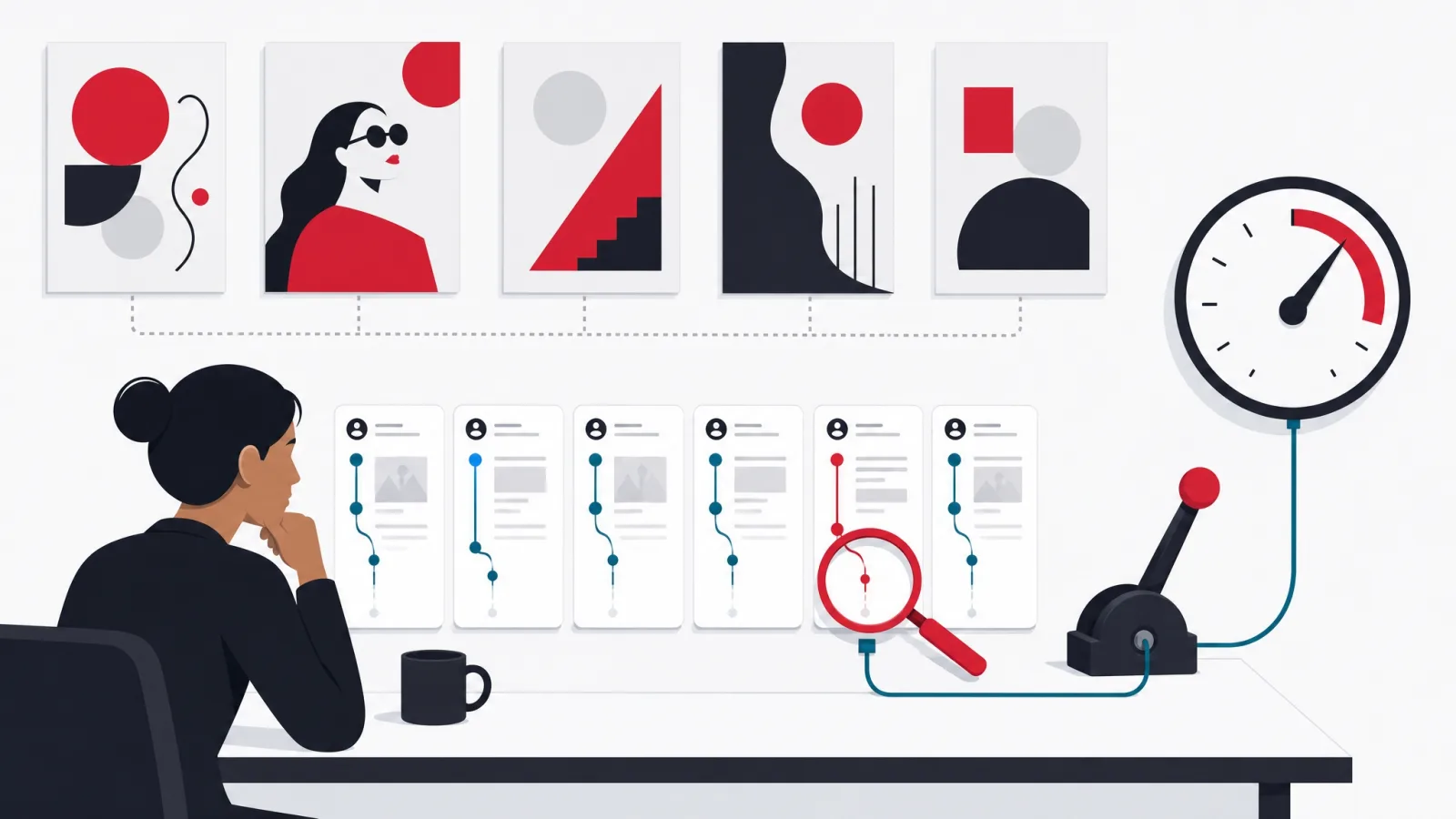
Design trends describe what interfaces look like this year; they do not describe what your users struggle with, which is why redesigns chasing them so rarely move a metric. The work that does move metrics runs in the opposite order: start from evidence about where users hesitate, drop off or fail, choose the lever that evidence points to, which is usually a form, a page speed, a sentence of copy or a missing trust signal rather than a visual style, make one change, and measure it against the numbers you started from. A design system then turns each win into a default, so quality compounds instead of resetting with every project. Trend awareness has a place in that practice, but as vocabulary, not as strategy.
Every year the same article gets written a thousand times: the design trends to watch, illustrated with beautiful interfaces, none of which belong to the reader. The genre is popular because it is pleasant, and it persists because it flatters a hope every product team carries, that the gap between their product and a better one is a coat of paint. It almost never is. Teams that redesign to the trend list typically end the quarter with a more fashionable product and the same conversion rate, because the trend list answered a question their users were not asking.
This guide is about the question users are asking, which is whether they can finish what they came to do, and about the design work that answers it. That work has an unglamorous shape: evidence first, one lever at a time, measured against the numbers that prompted the change. It reliably beats the redesign in outcomes, and it costs less, because most of what it finds can be fixed without repainting anything.
It is written from inside a working UI and UX design practice that gets asked for trend-led redesigns weekly and talks most clients out of them. What follows is the method we use instead: what UI and UX each actually cover, where the evidence comes from, which levers move conversion and which only move opinions, and how a design system makes the wins permanent.
Key takeaways
- UI and UX are different questions. UI asks whether the screen is clear and consistent; UX asks whether the whole journey, from arrival to the moment of value, actually works. Most conversion problems live in the journey, not the paint.
- Trend lists answer "what do interfaces look like this year." Your users are asking "can I finish what I came to do." A redesign that answers the first question while ignoring the second usually leaves the metrics where they were, or briefly worse.
- Evidence is cheaper than a redesign. Five recorded user sessions, a funnel report and a form analytics pass will locate the real problem for a fraction of what a visual overhaul costs, and they frequently point somewhere no trend list mentions.
- The levers with real leverage are unglamorous: fewer form fields, faster pages on mid-range phones, clearer words at decision points, forgiving error handling, and trust signals next to the commitment. Visual restyling alone sits at the bottom of the list.
- A design system is how good decisions stop being heroics. Tokens, components and patterns make the right choice the default one, which is worth more over a product’s life than any single redesign.
- Test one change at a time against the metric that made you change it. If traffic is too small for a formal split test, watch users and compare cohorts before and after; imperfect evidence beats confident guessing.
- Run design as a practice, not a project. A continuous loop of evidence, change and measurement outperforms the redesign-every-three-years cycle on every metric except novelty.
UI and UX: two questions that get asked as one

The two letters travel together so consistently that the distinction has blurred, and the blur has a cost: teams buy one when they need the other. UI, the user interface, is the surface, the screens, the type, the color, the spacing, the components a user actually touches. UX, the user experience, is the journey, everything between the moment someone arrives with an intention and the moment that intention is satisfied or abandoned. A product can have an impeccable interface and a broken experience, a gorgeous checkout that users never reach because the path to it makes no sense. It can equally have a dated interface carrying an excellent experience, which is why some visually unremarkable products convert stubbornly well.
The distinction matters because the two are diagnosed differently. Interface problems are visible in a screenshot: inconsistent buttons, unreadable contrast, a layout that collapses on a narrow phone. Experience problems are invisible in a screenshot and only appear in motion: a signup that asks for a credit card two steps too early, a search that returns nothing for the words real customers use, a form that throws away twelve fields of input over one validation error. Teams that review designs as static images systematically catch the first kind and miss the second, and the second kind is where the money is.
A useful habit is to name the question before commissioning the work. "Our product looks dated next to competitors" is a UI question, and a visual refresh answers it. "Users sign up and never come back" is a UX question, and no amount of visual refresh will touch it, because the problem lives in the journey, the onboarding, the empty states, the moment the product first proves useful. Most briefs that arrive at a design team are UX questions wearing UI clothing, and the single most valuable thing a designer can do in the first meeting is take the clothing off.
None of this makes the interface unimportant. The surface is where trust forms in the first seconds, and visible sloppiness, misaligned elements, three shades of the same blue, inconsistent language, tells users something true about the care behind the product. The point is order, not priority: fix the journey first, because a beautiful surface on a broken journey converts nobody, then let the surface express the care the journey now deserves.
The vocabulary, separated
- UI (user interface)
- The surface a user touches: screens, components, type, color, spacing, motion. Judged on clarity, consistency and accessibility.
- UX (user experience)
- The whole journey from intention to outcome, across screens and beyond them. Judged on whether users finish what they came to do, and return.
- Usability
- The narrower, testable core of UX: can a first-time user complete a defined task without help, and how long does it take them.
- Conversion
- The share of visitors who complete the action the product exists for: a purchase, a signup, a booking. The metric most design work is ultimately accountable to.
- Design system
- The shared library of tokens, components and patterns a team builds screens from, which makes consistency the default instead of an act of discipline.
- A/B test
- Showing two versions of a screen to comparable audiences at the same time and measuring which converts better, so the decision is made by users rather than by taste.
Why trend lists make weak roadmaps

Trend lists are honest about what they are: a survey of what visually ambitious products shipped recently. The dishonesty enters when they are read as instructions. A trend earns its place on the list by being noticeable, and noticeable is close to the opposite of what most working interfaces need, which is to disappear behind the task. The dark themes, the oversized type, the dimensional illustrations and the animated everything that populate these lists were, in their source products, decisions made against those products’ specific audiences and brands. Transplanted without that context, they are decoration, and decoration has never fixed a funnel.
There is also a survivorship problem. The products a trend list showcases are selected for how they look, not for how they perform, and the list never reports whether the striking redesign helped or hurt the numbers. Some of the most screenshot-worthy interfaces of any given year quietly converted worse than the plainer versions they replaced, and were rolled back after the award season. The reader sees the screenshot and not the rollback, and concludes the industry has moved somewhere it has not.
The deeper issue is what a trend cannot know: anything about your users. A trend list does not know that half your traffic is on mid-range phones over weak connections, for whom the fashionable animation is three seconds of jank. It does not know your buyers are procurement managers who need density and comparability, not whitespace and mood. It does not know the exact sentence on your pricing page where sessions go to die. Every one of those facts is discoverable for less than the cost of a redesign, and each is worth more than the whole list.
Held in its place, trend awareness is genuinely useful. Conventions migrate, and an interface that ignores where conventions have settled starts to feel foreign in ways that create real friction; users now expect certain gestures, certain icons, certain patterns to mean certain things. The practical posture is to treat trends as vocabulary, worth knowing so your interface speaks the current language, and never as strategy, because strategy has to come from evidence the trend list does not contain.
Evidence first: finding the real problem
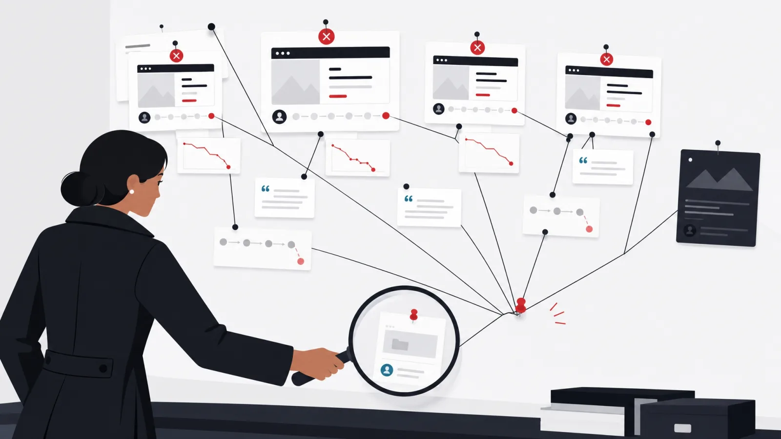
The alternative to designing from trends is designing from evidence, and the evidence is dramatically cheaper than most teams assume. Five users, recorded while they attempt your product’s core task and asked to think aloud, will surface the majority of serious usability problems; the pattern is so reliable that the fifth session usually confirms what the first four found. Add a funnel report showing where sessions actually drop, and form analytics showing which field users abandon on, and a team has a diagnosis that no amount of internal debate would have produced, for roughly the cost of a day.
The findings are humbling in a specific way: they are almost never about visual style. Users do not abandon carts because the buttons are last year’s shape. They abandon because shipping costs appeared late, because the address form rejected a legitimate address, because the page took too long on their phone, because an error message said something went wrong without saying what. Watching five sessions converts a team from arguing about aesthetics to arguing about facts, and the facts have a way of ending arguments.
Evidence also protects the roadmap from the loudest voice in the room, including when the loudest voice is the designer. Every practitioner carries taste, and taste is valuable at the level of craft, but taste is a terrible arbiter of what to work on next. A written diagnosis, here is where users fail, here is what they said, here is the number, turns prioritization from a status contest into a sorting exercise, and it survives the meeting in a way opinions do not.
The discipline this requires is modest but real: the willingness to delay the fun part. Opening the design tool is more pleasant than reading session recordings, and proposing a bold new direction is more glamorous than fixing an address validator. Teams that skip to the fun part ship attractive guesses. Teams that hold the order, evidence, then diagnosis, then design, ship fixes, and their metrics show the difference within a quarter.
The evidence pass that should precede any redesign
- Watch five real users attempt the core taskRecorded, thinking aloud, on their own devices. Count where they hesitate, backtrack or fail, and write down their words, not your paraphrase.
- Pull the funnelSession counts at each step from landing to completion. The biggest single drop is your candidate problem, whatever the redesign brief says.
- Read form analyticsWhich field is abandoned on, which throws the most validation errors, how long completion takes. Forms are where conversion goes to die quietly.
- Test on a mid-range phone over a weak connectionNot the newest device on office wifi. If the product is slow where your users actually are, speed is the design problem.
- Search your support ticketsThe phrases users repeat in tickets are usability findings someone already paid to generate. "How do I" tickets map directly to interface failures.
- Write the diagnosis before opening a design toolOne page: the three biggest evidenced problems, each with its number. Every design decision that follows should trace back to this page.
The conversion levers with real leverage
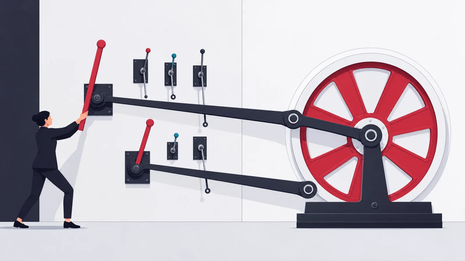
Once the evidence has located the problem, the fixes cluster into a short list of levers, and the list is consistent enough across products to be worth knowing in advance. The first is the form. Every field is a small toll, and the tolls compound: forms that ask less get finished more, and most forms ask for things the business wants rather than needs. Cutting fields, deferring the optional ones until after the commitment, accepting sloppy input and cleaning it up in code rather than bouncing it back, these changes are invisible in a portfolio and visible in revenue.
The second lever is speed, which is a design decision wearing an engineering costume. The weight of images, the number of fonts, the animation budget, the amount of interface that must load before the user can act, all of these are chosen at design time. Users on mid-range phones over real networks, which in most markets is most users, experience a slow product as a broken one, and they leave before the aesthetic has a chance to make its argument. A design practice that never tests on cheap hardware is optimizing for its own screenshots.
The third lever is language. At every decision point, a button, a plan comparison, a confirmation, the words are doing more work than the visuals, and vague words lose. "Continue" tells a nervous buyer nothing about what happens next; "Review your order" does. An error that says "invalid input" starts an argument; one that says what is wrong and how to fix it ends one. Copy is the cheapest material in the interface to change and routinely produces the largest per-hour returns of anything on this list.
The fourth lever is trust at the moment of commitment. Users hesitate exactly where the interface asks something of them, an email address, a card number, a signature, and hesitation is resolved by proximity: the security signal, the returns policy, the human contact, the transparent total, placed next to the ask rather than on a distant page. And beneath all four levers sits accessibility, which is not a separate compliance chore but the same work: sufficient contrast, honest focus states, labels that screen readers can speak, targets a thumb can hit. Every accessibility improvement is a usability improvement for everyone in a hurry, on a small screen, or in bright sunlight.
Working the levers
Do this
- Cut the form before styling itRemove or defer every field the transaction does not strictly need. The prettiest twelve-field form loses to a plain four-field one.
- Write error messages as instructionsSay what is wrong, in the user’s language, next to the field, with the fix. Keep everything the user already typed.
- Put trust signals next to the commitmentThe security note belongs beside the card field, the returns policy beside the buy button, not in the footer.
Not this
- Restyle a funnel you have not measuredA visual refresh on an undiagnosed funnel moves the problem around and calls it progress. Diagnose first; the paint can wait.
- Animate the path to the primary actionMotion that delays or obscures the thing users came to do is a cost paid on every visit. Save the choreography for moments of celebration, not decision.
- Design only on flagship devicesIf the team never sees the product on a three-year-old phone over a weak connection, the majority experience is unreviewed.
Design systems: turning wins into defaults
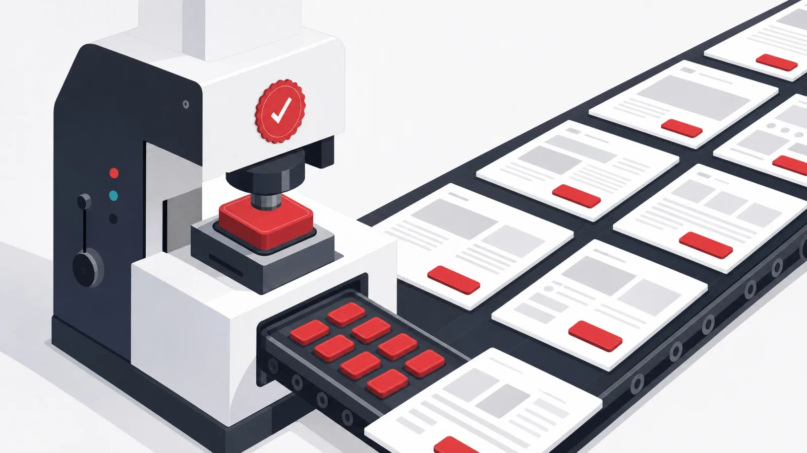
Every lever in the previous section can be pulled once, heroically, and then lost. The form gets cut, and a year later a new campaign adds five fields back. The error messages get rewritten, and the next feature ships with "something went wrong." The mechanism that prevents this backsliding is the design system: the shared set of tokens, components and patterns that screens are assembled from, in which the good decision is not a memory but a default.
The layers matter because they fail differently. Tokens, the named values for color, type and spacing, are what make consistency enforceable: when the accessible contrast pair is the named default, every new screen inherits it without anyone remembering to check. Components, the built buttons, inputs, dialogs and tables, are where behavior lives: the input that keeps user data through a validation error protects every form that uses it, forever. Patterns, the assembled flows for checkout, onboarding, search, are where hard-won journey knowledge accumulates: the checkout pattern that shows costs early because evidence demanded it makes that lesson permanent.
The economics are the argument. Before a system, every screen is bespoke: designed from scratch, built from scratch, drifting from its siblings from the day it ships. After a system, most screens are assembled from parts that were designed carefully once, and both design and engineering hours per screen fall while consistency rises. The system also changes what a redesign even means: refreshing the brand becomes an update to tokens and components that propagates everywhere, instead of a two-year archaeology project across a hundred bespoke screens.
A warning from the field: the system is a means, and teams occasionally forget that. A design system that grows its own roadmap, its own backlog of speculative components, its own definition of done disconnected from shipping product, has become self-portraiture. The test of a healthy system is boring and external: are product screens shipping faster, more consistently, and more accessibly than they did before it existed. If yes, feed it. If no, the system is a hobby wearing a process costume.
Testing what you changed
Evidence found the problem and a lever addressed it; the loop closes only when the change is measured, and this is the step most teams skip, because shipping feels like finishing. The gold standard is the split test: two versions live at once, comparable audiences, a single metric declared in advance. Run properly, it removes taste, seniority and recency from the verdict entirely, and it regularly embarrasses everyone by picking the version nobody in the room preferred. That embarrassment is the point; it is what learning looks like from the inside.
Split testing has honest prerequisites, and pretending otherwise wastes quarters. It needs enough traffic through the tested step to reach a verdict in weeks rather than years, one change at a time or the verdict is unattributable, and the discipline to declare the metric before looking at the data, because a dashboard tortured long enough will confess to anything. Teams below the traffic threshold should not fake the ritual; a test that would need fourteen months to conclude is a ceremony, not an experiment.
Below that threshold, the honest tools are sequential rather than parallel. Measure the metric for a few weeks, ship the change, measure again, and hold the result lightly, since seasonality and campaigns muddy the water. Rewatch five users on the new version and count whether the stall you fixed is actually gone. Track the support tickets that named the old problem and see whether they stop. None of this is as clean as a split test, and all of it beats the alternative, which is deciding the change worked because it shipped.
Whatever the method, the results deserve a memory. A short log of what was changed, why, what was expected and what happened, turns individual tests into an institutional asset: patterns emerge across entries, the same lessons stop being relearned annually, and new team members inherit evidence instead of folklore. Teams that keep this log discover something useful about themselves within a year, usually that their intuitions are right slightly more than half the time, which is precisely why the measuring matters.
One measured change, start to finish
-
Declare the metric and the current numberBefore design
One sentence before any work: checkout completion is X percent, and this change is intended to raise it. Written down, dated, visible to the team.
-
Change one thingDesign and build
The smallest version of the fix the evidence points to. Bundled changes produce unattributable results, and unattributable results teach nothing.
-
Choose the honest measurementBefore launch
Enough traffic: a split test with audiences divided at random. Not enough: before-and-after windows, rewatched sessions, ticket counts. Say which you are using and why.
-
Run it to the declared finishMeasurement
A split test runs to the sample size chosen in advance, not to the first exciting day. A before-and-after runs long enough to see past launch noise.
-
Log the result, keep or revertClose the loop
The number moved, did not move, or moved the wrong way; all three are findings. Record it, act on it, and feed what was learned into the next diagnosis.
Design as a practice, not a periodic project
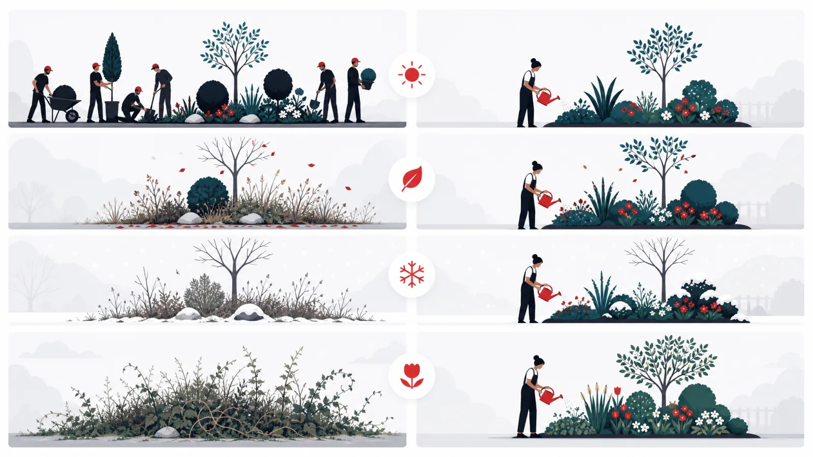
The redesign cycle most organizations run, ship, neglect for three years, declare the product dated, redesign everything at once, is the most expensive possible way to buy design quality. It concentrates risk in one launch, charges the full relearning tax on every user simultaneously, and throws away the compounding that makes design cheap: each cycle starts from scratch because nothing was maintained in between. The alternative is unglamorous and strictly better: design as a standing practice, running the evidence-lever-measurement loop continuously, shipping small improvements weekly against the metrics that matter.
The practice has a modest staffing shape. It needs someone accountable for the evidence, keeping the session recordings, funnels and form analytics current instead of commissioning them in a crisis. It needs design capacity close to the delivery team, inside the sprint rather than upstream of it, so findings become changes in days. And it needs the design system treated as live infrastructure, with the same maintenance expectations as the codebase, because a system that stops absorbing lessons stops being the place where lessons live. Teams choosing a build partner should ask directly how design integrates with delivery; the answer separates partners who design as they build from those who staple a design phase to the front of a contract, and our own framework selection guide makes the matching argument for the technology side of the same decision.
The practice also changes the relationship with trends, to a healthier one. A team running continuous evidence does not need to ask whether this year’s visual fashion applies to them; they can test it, small, on one surface, measured like any other change. Sometimes the trend wins, conventions really do migrate, and adopting a settled one removes friction. Sometimes it loses, and the team has spent a week learning that instead of a quarter shipping it. Either way the trend has been demoted from strategy to hypothesis, which is where it always belonged.
What this buys, over a few years, is a product that never becomes the dated embarrassment that justifies the next big redesign, because it never stopped improving. The metrics climb in small steps rather than lurching. Users never face a screen they must relearn from zero. And the design budget, spent in the same total quantity, purchases compounding improvement instead of periodic demolition. The teams that work this way rarely appear in trend lists, and their funnels are the reason they do not mind.
Frequently asked questions
What is the difference between UI and UX design?
UI design is the surface: the screens, components, typography, color and spacing a user touches, judged on clarity, consistency and accessibility. UX design is the journey: everything between a user arriving with an intention and that intention being satisfied, judged on whether people finish what they came to do and come back. They are diagnosed differently, interface problems show in a screenshot, experience problems only show in motion, and most conversion problems are experience problems, which is why a visual refresh so often fails to move the numbers.
What are the current UI design trends worth following?
The honest answer is that the list changes yearly and matters less than any list-writer admits. Trends worth adopting are the ones that have hardened into conventions, patterns users now expect everywhere, because ignoring those creates real friction. Trends worth testing are the ones that plausibly serve your specific users, tried small on one surface and measured. Trends worth skipping are the ones adopted because a screenshot looked good, which is most of them. Treat the lists as vocabulary, not strategy, and let your own funnel evidence set the roadmap.
Why did our redesign not improve conversion?
Usually for one of three reasons. The redesign answered a UI question when the funnel had a UX problem, so the journey failed as beautifully as before. Or it changed everything at once, so whatever helped was canceled by whatever hurt, and no one can tell which was which. Or it charged the relearning tax: returning users had to relearn screens they already knew, which depresses metrics for weeks even after a good redesign. The fix for all three is the same order of operations: evidence, one lever, measurement.
How do we improve conversion through design?
Start where the evidence points rather than where the instinct does. The levers with consistently high leverage are cutting and simplifying forms, making pages fast on mid-range phones, sharpening the copy at decision points, handling errors without destroying user input, and placing trust signals next to the moment of commitment. Visual restyling alone sits at the bottom of that list. Make one change at a time, measure it against the metric that motivated it, and keep a log so the lessons accumulate.
What is a design system and do we need one?
A design system is the shared library your screens are assembled from: tokens for color, type and spacing, components like buttons and forms, and patterns like checkout or onboarding flows. Its value is making the good decision the default, accessibility, consistency and hard-won journey lessons get built in once and inherited everywhere. Any product with more than a handful of screens and more than one person shipping them benefits. Start from an audit of what already exists rather than from scratch, and judge the system on whether product screens ship faster and more consistently.
How many users do we need for usability testing?
Five, per round, is the working answer. Watching five representative users attempt your core task surfaces the large majority of serious usability problems, and the sessions repeat themselves enough by the fifth that further ones add little. The important qualifiers: they should be real or representative users, not colleagues; they should work on their own class of device; and the five-user figure is per round and per distinct task, so a practice runs many small rounds over time rather than one large study once.
Can we A/B test with low traffic?
Formally, usually not: a split test needs enough completions through the tested step to reach a verdict in weeks, and below that threshold the test would run for months and conclude nothing. The honest low-traffic toolkit is sequential instead: measure the metric before and after the change with a generous window, rewatch a handful of user sessions on the new version to confirm the specific stall is gone, and track whether the support tickets that named the problem stop arriving. Less clean than a split test, far better than declaring victory at launch.
The practice behind this method is a working one. AgileTech is an AI native software development partner in Vietnam whose design team sits inside delivery, runs the evidence pass before any restyle, and is measured on the same funnel numbers the client is.
Source: https://agiletech.vn/blog/ui-ux-design-practice/ · (c) AgileTech Vietnam. Printed from agiletech.vn.